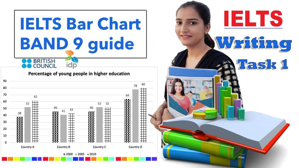
The chart below shows the percentage of young people in higher education in four different countries in 2000, 2005, and 2010.
The bar graph illustrates the proportion of youth in higher education in four different countries between 2000 and 2010.
Overall, it can be seen that country D had the highest proportion of youth enrolled in tertiary education over the ten-year period. Also, in all the countries apart from country B, there was an increase in youth enrollment over a decade.
The most significant rise in youth enrollment in higher education could be seen in country A and D. In 2000, about 38% of young people from country A were enrolled in universities, while in 2010 the proportion stood at 62%. Similarly, Country D also witnessed a substantial rise in the proportion of young people studying in higher educational institutes, with figures rising from 64% in 2000 to 80% in 2010.

In country C, there was a marginal rise and the proportion of youngsters studying in universities went up by 6% to reach 52% over the decade. Unlike countries A,C and D there was a fluctuations in a percentage of youth in higher education programs in country B. The figure fell from 46% to 41% till 2005,but then rose slightly to stand at 43% in 2010.
