Ielts Writing Task 1 Bar Chart | 8 Band Sample
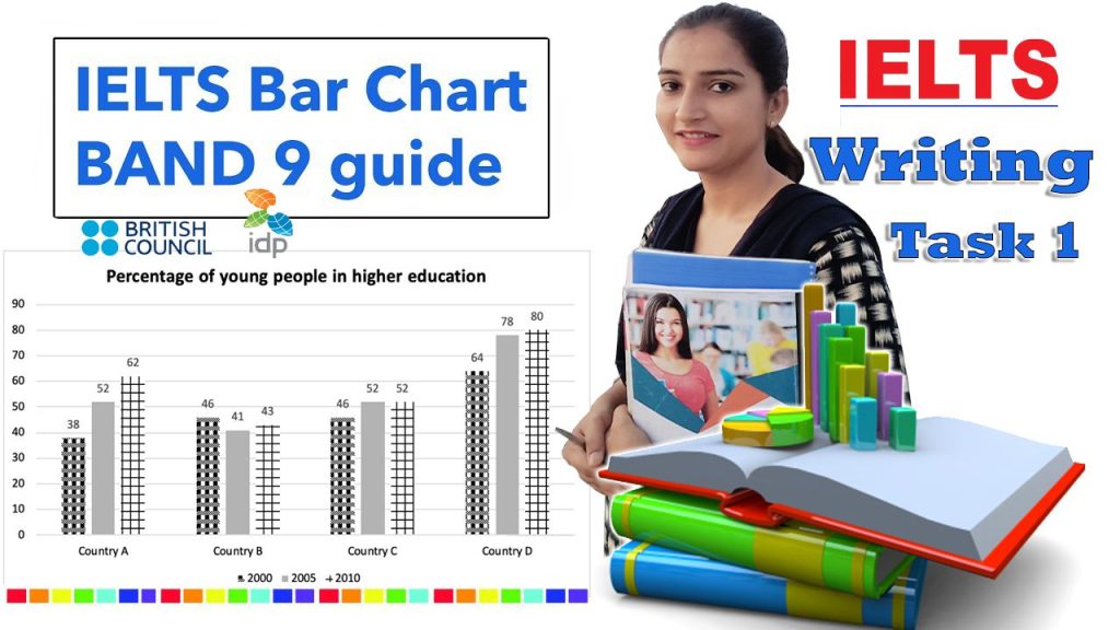
The chart below shows the percentage of young people in higher education in four different countries in 2000, 2005, and 2010. The bar graph illustrates the proportion of youth in higher education in four different countries between 2000 and 2010. Overall, it can be seen that country D had the highest proportion of youth enrolled […]